Pattern Mixing and Layering
When decorating a room or home, there is perhaps nothing more daunting than building the layers of patterns, textures, and colors. There is so much to consider: fabric content, durability, color, texture, scale, pattern, drape, undertones, proportions of each element, and, of course, budget. Beyond just selecting things you love, you need to consider how the different layers in your design play off each other to deepen the story you want your room to tell, whether together they create a whole which is greater than the sum of its parts, and will you still love it all when you are done. There are so many decisions to make and the internet has so much advice to offer. How do you ever start?
You could begin with a simple rule to develop your pattern mix, like interior design’s 60-30-10 rule for painting a room. Following the 60-30-10 rule, the main color should be used 60% of the time, the secondary color 30%, and accent color 10%. Replace the word “color” with “pattern,” “scale,” or “texture,” and you can run with this rule. But I would propose that there are two things more important than rules if you want to infuse your home with spirit, joy, and personality, and those two things are strategy and confidence.

One simple strategy to build your confidence with pattern mixing is to select components you love which relate to each other, sharing similarities and differences, either in pattern, color, or scale. For example, you might pair a navy plaid with a narrow navy ticking stripe, or pull an entire palette of accent colors from an exuberant multi-colored design. A failsafe version of this approach is to use textiles from a single collection of a fabric house, all using the same or similar colorways but in different patterns and scales. In 1947, Bloomcraft introduced their Saison Happily Married fabrics with ads that emphasized the ease they offered in mixing and matching designs. The suite of fabrics were like the Garanimals of the midcentury interiors world, guaranteeing success with pattern mixing and layering with their coordinated and fashionable motifs (designers included Rockwell Kent and Georges Braque). Many of these vintage fabrics can still be found today in the resale market.
If you have two or more connected rooms, especially ones with extensive sight lines into each other, you could try weaving the same elements through each of the rooms, but in varying or complementary doses. Your living room might have a particular print serving in a major role, with the colors extending into the dining room or den, but not the pattern. Or maybe the pattern does come into the second space, but is used sparingly, like on a lampshade or pillow. You could use the same colors and patterns in each room, but give the leading role to a different pattern or color in each. For example, the first room might be predominantly blue with pink and green accents, the second room predominantly green with pink and blue accents, the third room pink with blue and green accents, and the hallway which connects to each of the rooms might be white with a large abstract painting in pink, blue, and green.
An easy and highly personal strategy is to begin your room with a hero piece, or showstopper, which then inspires all the other things you bring into the space. Your showstopper should be dramatic and special, something that makes the room sing, like a lively drapery or wallpaper pattern, an antique painted hutch, an intricate rug, or a vivid painting. Individual elements of that hero piece – colors, textures, patterns, fibers, moods – can then be used to form the background chorus in wall colors and upholstery, and to take supporting roles as throw pillows, chair seats, and table toppers.

[Bain News Service, publisher, Public domain, via Wikimedia Commons]
Elsie de Wolfe championed this method in her 1913 book, The House in Good Taste (Dover Publications, 2017). Here she describes using a brightly colored chintz fabric as the starting point for her decoration of a dressing room:
The chintz is covered with parrots which make gorgeous splashes of color on the black ground. The color of the foliage and leaves is greenish-blue, which shades into a dozen blues and greens. This greenish-blue has been used in the small things of the room. The chintz curtains are lined with silk of this tone, and the valence at the top of the group of windows is finished with a narrow silk fringe of this greenish-blue. The small candle-shades, the shirred shade of the drop-light, and the cushion of the black lacquer chair are also of this blue…. The quaint triplicate mirror is of black lacquer decorated … in gold, and the little three-cornered cabinet in the corner is also of black and gold. The chintz is used as a covering for the dressing-seat. (p. 100-101)
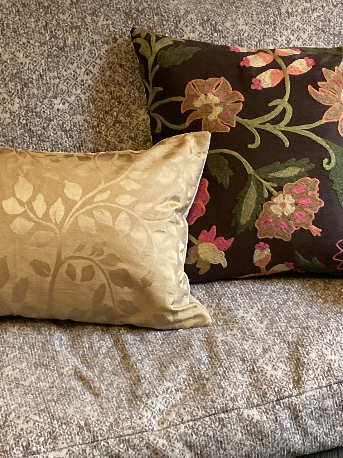
You could borrow a strategy from another design realm, for example, creating a garden planter with fillers, spillers, and thrillers. To translate that to interiors, the fillers might be found on major upholstery, floors, wall coverings, and drapery, and there will almost always be more than one filler in a room. The fillers used for your upholstery or drapes might consist of a small scale or neutral pattern or texture, a single color or a block print, plaid, stripe, or subtle weave, or a significant design like toile de Jouy. Whether subtle or dramatic, fillers form the backdrop to your design, and help establish the color and texture palette for your room.
Spillers keep your eyes moving around the room by building layers of color, texture, scale, and tension on the base provided by the fillers. Spillers can be as neutral or exuberant as the fillers, while offering variation, picking up on elements of one or more fillers (the pattern of a flower or leaf, the texture of the tape on the leading edge of your drapery, a shade lighter or darker than the color of your walls or upholstery). Spillers can be used on throw pillows, dining chair seats and/or backs, café curtains, and smaller upholstery pieces like footstools, ottomans, and table skirts. The fillers help your eyes rest, while the spillers give your eyes a reason to move.

Following this analogy to its conclusion, the thrillers exist to make you happy, and bring to life the feel and function of a room. They are individual and unexpected, and should be used in small doses but with confidence. Depending on your personal style, the thriller might be another neutral from the same colorway as your fillers and spillers but in a more lively texture, it might be a orange linen throw in an all white room, or it might be a complete curve ball like an animal print.

Whether you use one or more of the strategies above, or develop your own, the result may still not be everyone’s cup of tea. To some a room drenched in many complementary strong patterns and colors will read as comfort, while to others it will be chaotic and cluttered. To some a room furnished in neutral linens, wools, and cottons, will read as boring, while others will find it coherent and cozy. What will ultimately makes your design “work” is the confidence of your choices, and the joy they bring to you, not how well you’ve followed the rules. After all, most of us are simply decorating for ourselves and our families, not for publication, competition, or clients. Your choices, placed with conviction, will make a room come alive because they bring you joy and make the room uniquely yours.
Finally, the most challenging aspect of pattern mixing and building layers in design may not actually be creating the initial design, but adapting it as our homes, tastes, and possessions change. Change happens when we move our stuff to a new home, become empty nesters, or inherit furniture or accessories more beautiful (or at least more something) than the things we already own. Or we’ve simply changed our minds or want to try something new. It happens if we live somewhere for a long time – the sun fades our curtains and rugs, the dog chews on our favorite chair, we discover mold in the bathroom, our accessibility needs increase. Maybe we’ve made so many small, incremental tweaks over the years that one of our foundational choices no longer serves as it once did – it stands out, and not in a happy, tiger velvet sort of way. Whatever may be behind the impulse for change, at some point, most of us will need to integrate new things or needs into an existing design. A confidently planned and executed design strategy has the ability to evolve and embrace change, and provides a roadmap for your imagination.
Pattern mixing involves balance and contrast, coherence and creativity, continuity and evolution, comfort and tension, in varying doses, or all at the same time. But the best design serves the life you lead, and many of the finest rooms are never completely finished.
For more about traditional and transitional style, click here
For more about slow decorating, click here
For more about family friendly design, click here
To browse and shop our Distinctly Modern Collection, click here
To browse and shop our Everyday Elegance Collection, click here